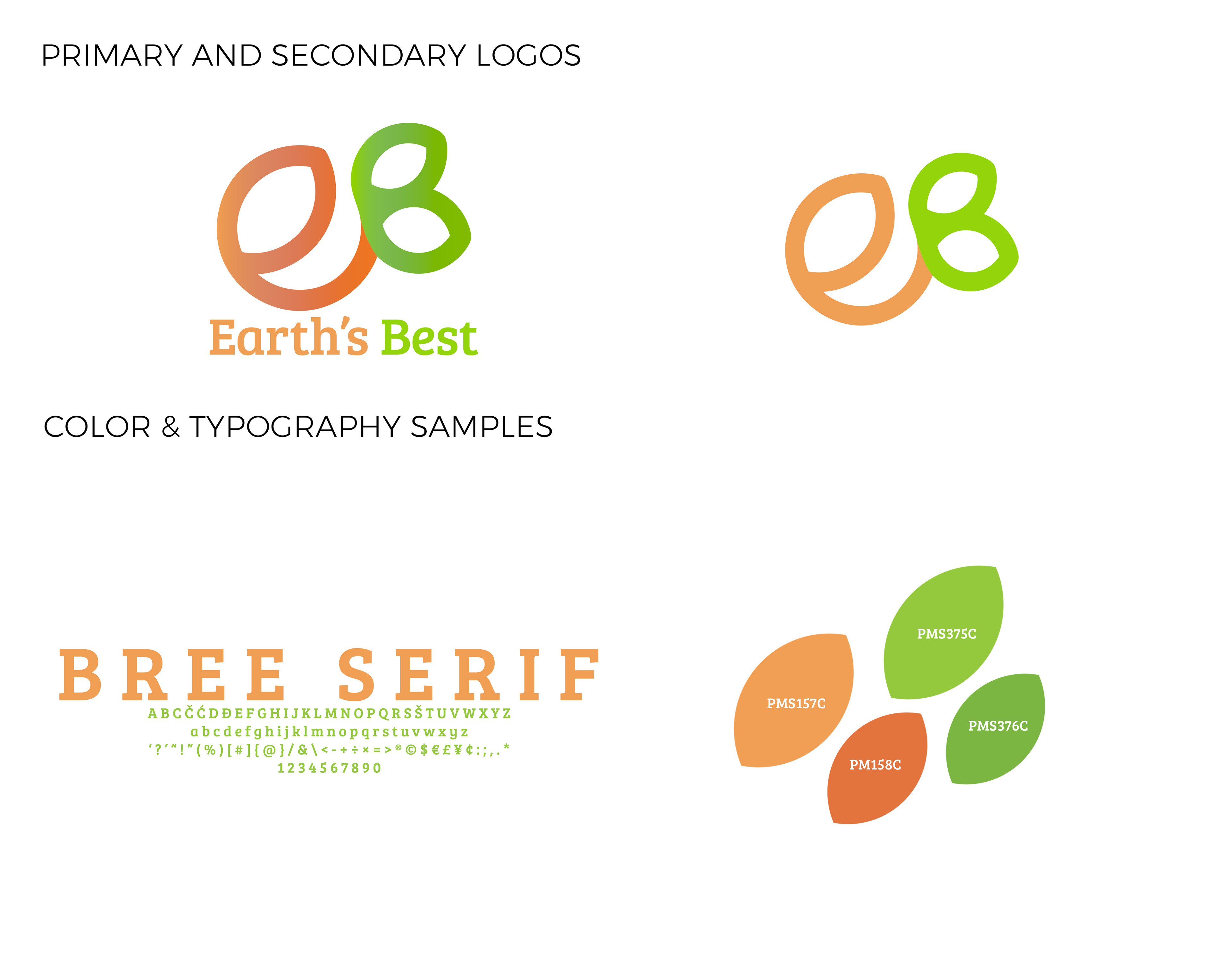

logo design, photography direction, photo manipulation
CHALLENGE
A logo needed to be created that demonstrates the organic nature of this company while reflecting it’s target market: parents of infants & toddlers. The ability to be easily recognize and differentiate this company was important so colors that pop and recognizable forms are a key component.
SOLUTION
Warm colors lend themselves to the organic nature of the company, while the form has the dual purpose of creating the company initials as well as the shape of a fruit and the natural circular form, reminiscent of the planet. Packaging has often been used to help identify the product via color, so for ease of transition, the basis of the style is maintained to allow transition of the redesign to process smoothly.